Understand the interrelationship between people, process, payroll and devices
A cross-functional team embarked on a journey to different regions within Kohl's territory,
in order to shadow and track a day-in-the-life of the Kohl's sales associates.
The journey taught us how dynamic our store environment can be, how flexible and fantastic our associates are, and
also uncovered many opportunities for improving our associates lives and our customers' shopping experience.
🎨 Experience Designer
⏱️ Oct, 2016 - April 2017
📄 In-store, Data Visualization
My Role
I was part of the core team of 12, including experience designers, store operation engineers, and ux researchers. I was involved in this entire project starting from research plan proposal, in-store data collection, data analysis, visualization, to stakeholder presentations. An associate journey map, interactive map, and two story boards were designed to be used by the executive leadership team as a tool to help inform priorities and decision making and influence future annual capital planning.
Goal
1. Understand how store associates in different roles spend their shift on the salesfloor.
2. Identify friction points within process to improve technology for associates and drive in-store conversion.
3. Undersatnd the interrelationship between people, process, payroll, equipment and technology.
IN-STORE RESEARCH

Based on a plan research team has drafted out, we are divided into 4 groups, each group has three
members from ux research, design and store operation engineer. And each team was dedicated to one
territory to observe 3 selected stores. We were observing 3 shifts of associates from around 9am
till 9pm. In order to get a good idea of different tasks & different roles, we shadowed different
roles in multiple departments. Each of us noted down our insights, notes and questions during the
shadow session in a special form we designed earlier (see below). At the end of each shift, we will
conduct a brief interview to further understand associates’ day to day work.

AFFINITY DIAGRAM
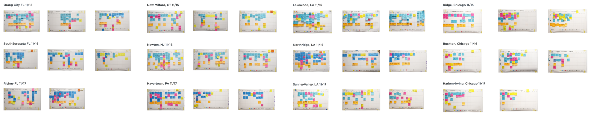
It was a large amount of data to clean up. As soon as we all got back to the office, we start
the conversation about how to clean, organize and further analyze the data we have. There are
notes of 420 store hours work, 35 interview records, time stamps on different tasks and location
stamps for each store per shift, plus all the pictures we captured during the shadowing session.
With affinity diagram, I helped designed this poster to put together most of notes we have. The
process was highly collaborative, members from 2 design studios and 3 teams are gathered around
to go through all data recorded per store one by one. It took us about a month to finish the
data analysis process.
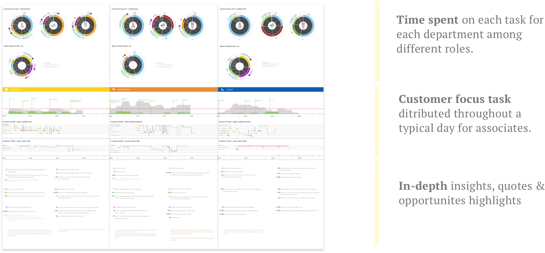
DESIGN SOLUTION
Now we have most of the data cleaned up based on different criterias.
The design team start to explore different ways to present the data to our stakeholders.
There were a lot back and forth with the research team to make sure the data is easy to
understand but at the same time, accurate. In the end, We delivered three main pieces in
order to capture associates' experience in different scales:
An associate journey map to understand their daily tasks in a heuristic view;
An interactive map to zoom into one store, one associate to present a typical shift;
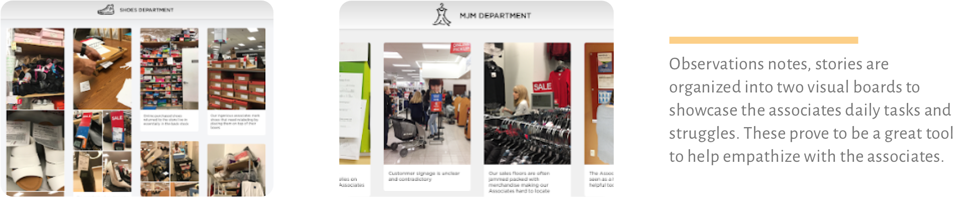
Two visual borads to further digest those painpoints for store associates.
For confidential reasons, only showcasing the screenshots and highlights.
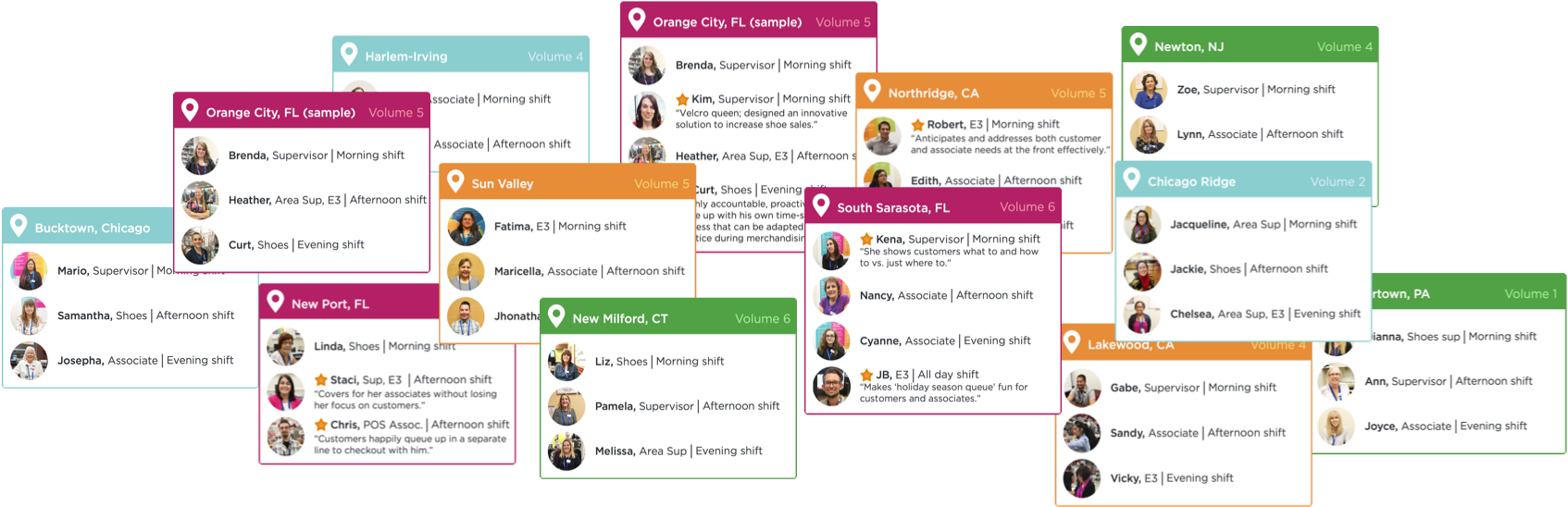
We documented all the associates we had shadowed with into the journey map. These cards provide a good
idea of what we have considered - roles, departments, timelines, store sizes and locations. All above have
been factored in the associate journey map deliverable package.
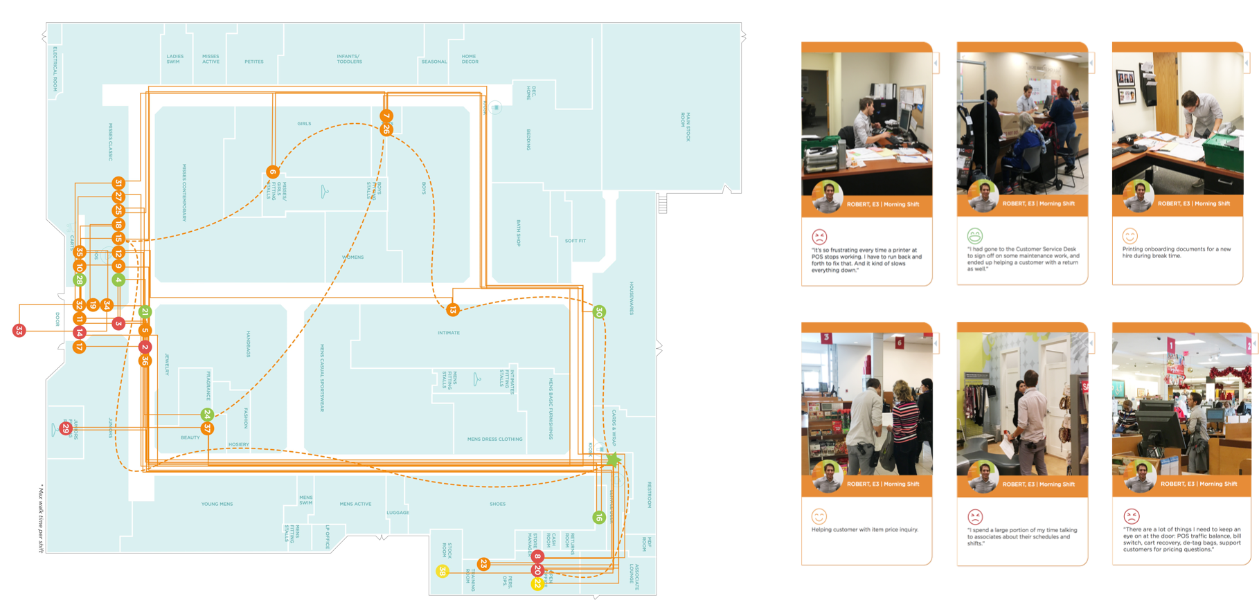
I designed this interactive map piece with the focus on demonstrating one associate’s one shift at one store using Axure.
This map documents and visualizes one associate’s walking path for one shift. Each point reprents one task. Color is used
here to indicate whether or not this associate feels frustrated. More details (task, emotions & highlights) can be
viewed by clicking into each point.
PRESENTATIONS
Presenting this journey map was a great learning experience for me. Since there are so many aspects and stories in the map, I have prepared different versions of stories based on the audience. For store operations team, I will empathsize mostly on the data patterns we found through quantitative research, and also the insights & recommendations from design team since they are very familiar with associates’ daily struggles. For product & business teams, I will elaborate more on the associates stories and frustrations to raise awareness on how could current technology better support their job. After each presentation, we will reflect on the questions we got and make updates to the journey map. There were 8 versions of updates we made throughout the process.
REFLECTION
I feel really fortunate to be part of a foundamental project like this.
I also really really appreciate that Kohl’s are willing to take the time
and resources to take a step back,
think in a bigger picture and then move forward.
This project was wrapped up in early 2017, but till today, we still get requests
from our partners to going back to those data, stories and insights we learned from it.
It is a great PR project to showcase what is user-centered thinking and doing.
As a matter of fact, our research team continued to work on sub-topic projects based on
insights from this associate journey map. For the design team, this is helping us to
priorities the work we have in the future and let the incoming designers to better
empathized with our associates work in the store.
It is difficult to provide an exact KPI or measurement on how much of an impact this
project has for Kohl’s. However, as part of the team, one thing that I know is that
everyone who works on this feel very proud of what we do.