Manage a long-term relationship with loyal customers

Today, Kohl's offers a Yes2You(Y2Y) rewards program
for non-Kohl's charge (credit card) holders to enjoy points off. It is a rewards
system introduced about 3 years ago. This rewards program significantly helped
Kohl's to win 2 types of customers:
1.People who love to shop & save at Kohl's but don't want to have another credit card.
2.Potential Kohl's charge holders who just start to shop with Kohl's.
While the program kept a lot of new Kohl's shoppers, its complicated calculation system is
keeping away a large amount of potential shoppers.
To simplify this points system, Kohl's loyalty team approached us with an exciting proposal:
Build a unified rewards platform based on Kohl's cash.
🎨 Experience Designer
⏱️ Pilot Lauch in 06.2018
📄 Mobile Experience
I helped the initial design pitch to get his new rewards program successfully founded by stakeholders and built the first draft of the core mobile experience flow together with other 2 experience designers, a visual designer, a design manager and a project planner.
DESIGN WORKSHOP
It can be very challenging to collaborate with a wide range of partners on
a big project like this. So our research team conducted a design workshop to
help align the expectations in the beginning. Together with the Business Credit,
Product, Store Operation, Creative and Marketing team, we analyzed the current
rewards program and envisioned the key takeways our future rewards program should follow:
KEY TAKEWAYS
-Transparent: Effortless understanding & usage of rewards program.
-Informative: Consolidate the current earning methods to create a single
window into earnings and savings.
-Celebrative: Leverage our data for personlized offers and to celebrate past,
present and future earnings.
"Kohl's Cash is more talked about than Y2Y. It has a larger impact on customer's long term behavior (2x more likely to drive upward migration)."
PITCHING TO THE STAKEHOLDERS
How to introduce the new rewards program? How to seamlessly provide the updated rewards info into the current flow? And how would this project impact the other ongoing projects? Based on the insights and takeaways from the design workshop, I created multiple design concepts to provide an initial look and feel for the core mobile experience.

To heuristically understand customer's needs, I leveraged this customer journey map. There are three different tags, which represent the three major parts in the new rewards program: track, earn and redeem. This helped the cross functional parnters and the business stakeholder to easily identify the key touch points in the new rewards experience early on.
CUSTOMER JOURNEY MAP

DEFINE THE SCOPE
The design pitch went very successful. It is so successful that more people are curious about the next steps. To better align and reflect business expectations on each screen across 5 different channels, I quickly put together this information architecture map in axure and reviewed it with the product and the rest of the design team to further analyze when, where and how should we integrate this new rewards program.


MOBILE FIRST
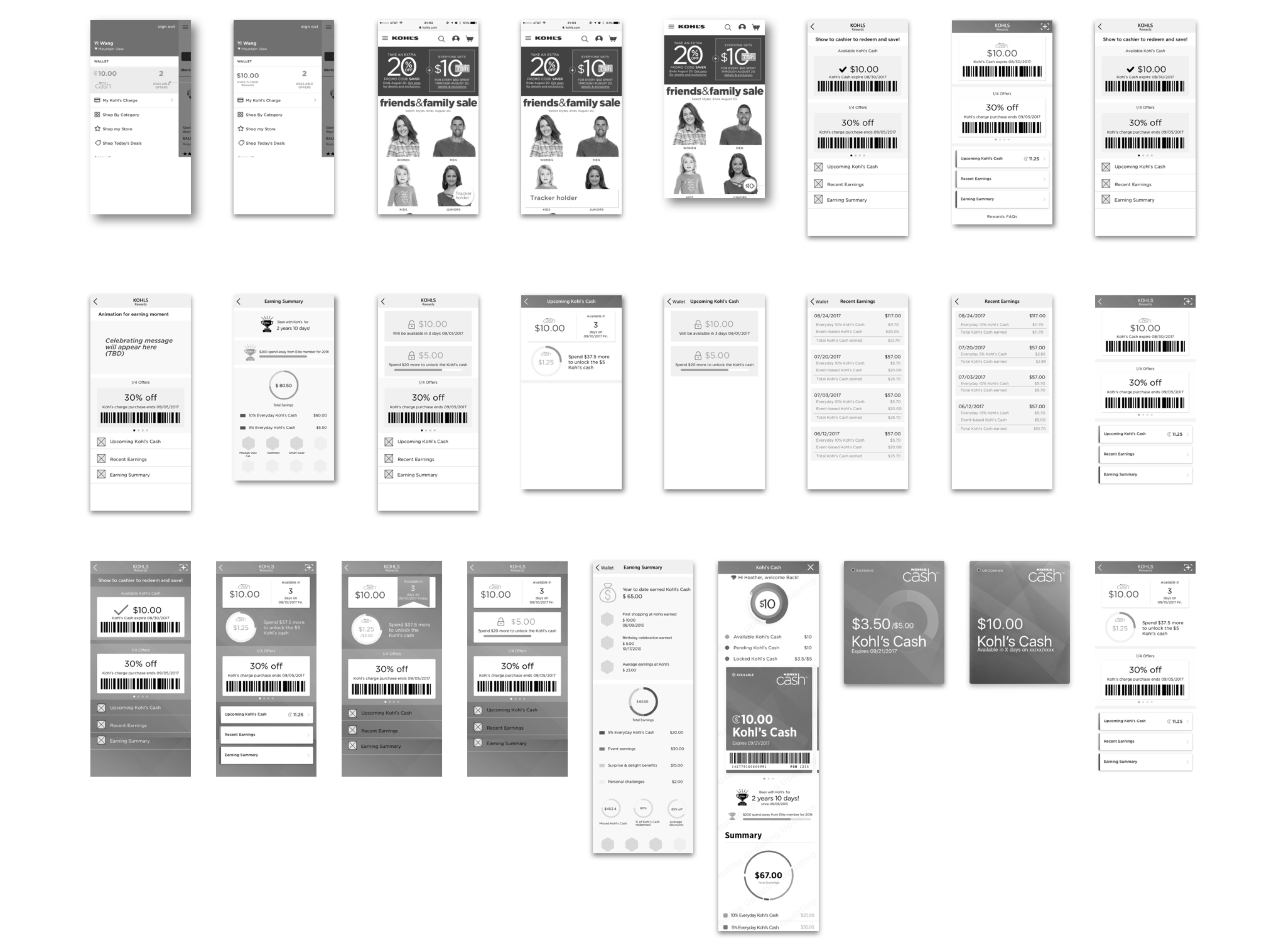
Based on the touchpoints identified, together with the other 2 designers, we went through different concepts and came up with the happy path for the core mobile experience.

DESIGN ITERATIONS

One key insights we had from the design workshop was about introducing the celebrative elements to the experience. So one design for order confirmation page was to first show this celebrative modal. When this concept first proposed, it was well reveived internally. However, when we tested it out in the lab, our customers reacted a little more confused than feeling celebrative. This finding leads to a better alignment within the team and I later replace this modal with a brief in-page animation design. This was one of the many stories about how we iteratively refined the design concepts based on customers' feedback.
DESIGN REFLECTION
Hi-fi or Low-fi?
When I first started this project, I was uncertain about what fidelity of wires I should present during different
meetings. After rounds of presentations and design pitches, I summarized my takeaways:
Hi-fi wires is more suitable for design concept pitching to business stakeholders, if there is a brainding team, work
with them to get a more accurate look and feel. Hi-fi wires are also very necessary for usability testing to get more
accurate feedbacks. When presented to product or engineer team, low-fi wires with water marks are better suited to avoid
confusing them with future deliverables.
Document Your Process
With so many designers involved in a long-term project, it is very easy to get lost. We used different tools, went to different meetings and took different notes. So document your design process with a consistent template, format in one place, work closely with your planner could be very helpful
Explore as a Discussion Point
We have 2 design studios at Kohl's. So oftern times, remote collaboration is inevitable. It can be challenging for deisgners to pitch ideas without visualize them in this scenario. Plus, I find it very difficult to propose good concepts without really exploring "bad" ideas. To make a strong design argument, oftern times, working on those "bad" ideas and go through them with your partnerscould make your design proposal more convincing.