Kohl's · In store & online
A unified rewards program based on Kohl's Cash
Manage a long-term relationship with loyal customers.
Kohl’s Yes2You (Y2Y) rewards program let shoppers without a Kohl’s Charge card earn points off. Introduced about three years earlier, it won over two kinds of customers: people who love to shop and save at Kohl’s but don’t want another credit card, and potential cardholders just starting to shop with Kohl’s.
But while it kept many new shoppers, its complicated points system kept many more away. To simplify it, Kohl’s loyalty team came to us with an exciting proposal: build a unified rewards platform based on Kohl’s Cash.
My role
From pitch to core mobile flow
I helped shape the initial design pitch that got the new program funded by stakeholders, then built the first draft of the core mobile flow with 2 other experience designers, a visual designer, a design manager and a project planner.
Design workshop
Gather all the thoughts up front
Collaborating with so many partners on a big project is hard, so our research team ran a design workshop to align expectations early. With Business Credit, Product, Store Operations, Creative and Marketing, we analyzed the current program and agreed on what the future one should be:
”Kohl’s Cash is more talked about than Y2Y. It has a larger impact on customers’ long-term behavior — 2× more likely to drive upward migration.”
Pitching to stakeholders
Share one vision through design
How do we introduce the new program? How do we fit updated rewards info into the current flow? How would it affect other ongoing projects? Building on the workshop, I created multiple concepts to give an initial look and feel for the core mobile experience.
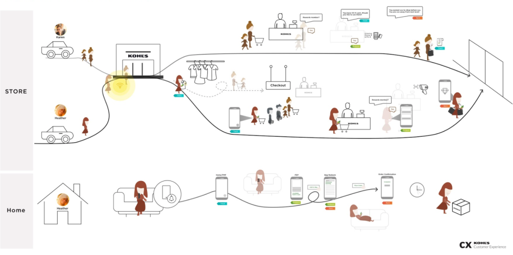
To understand customers’ needs at a high level, I used a customer journey map with three tags for the program’s main parts — track, earn and redeem — so partners and stakeholders could spot key touchpoints early.
Define the scope
Where are the touchpoints?
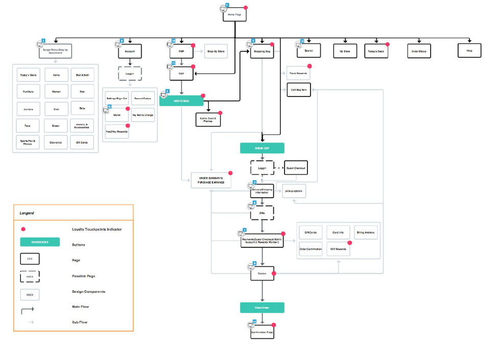
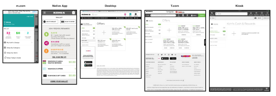
The pitch went so well that more people wanted to know what came next. To align business expectations for every screen across 5 channels, I put together an information architecture map in Axure and reviewed it with product and design to decide when, where and how to integrate the new program.
Mobile first
What is the happy path?
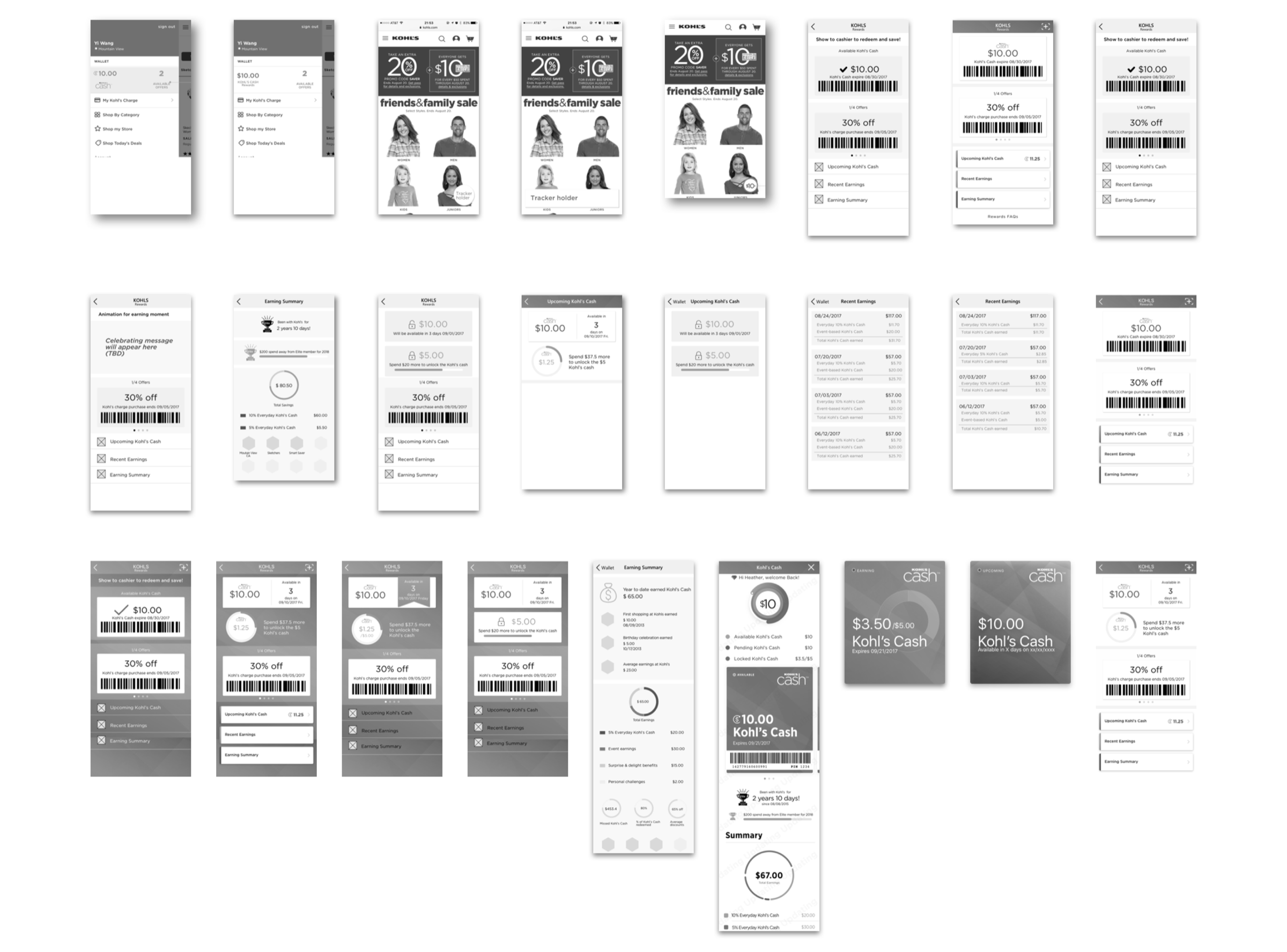
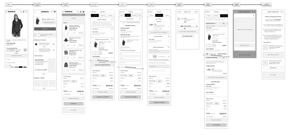
Based on the touchpoints we identified, the other 2 designers and I worked through concepts to define the happy path for the core mobile experience.
Design iterations
Order confirmation flow
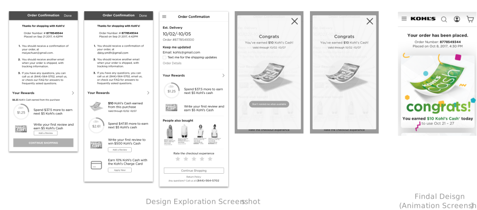
A key workshop insight was to bring celebration into the experience, so one order-confirmation design opened with a celebratory modal. It was well received internally — but in the lab, customers were more confused than delighted. That finding aligned the team, and I replaced the modal with a brief in-page animation. It’s one of many examples of refining concepts through customer feedback.
Design reflection
Design your process
Hi-fi or lo-fi?
At first I wasn’t sure what fidelity to bring to which meeting. My takeaways: hi-fi works best for pitching concepts to business stakeholders (with the branding team, if there is one), and for usability testing. For product and engineering, lo-fi wireframes with watermarks avoid confusion with final deliverables.
Document your process
With many designers on a long project, it’s easy to get lost across tools, meetings and notes. Documenting the process in one consistent place, and working closely with your planner, helps a lot.
Explore as a discussion point
With 2 design studios at Kohl’s, remote collaboration was a given — and it’s hard to pitch ideas without visualizing them. I also find it hard to reach good concepts without exploring “bad” ones. Working through those ideas with partners makes the final proposal more convincing.
Tools
- Paper & pencil
- Axure
- Sketch
- Google Slides
- Keynote
Methods
- Interviews
- Swimlane diagram
- Usability testing
Skills
- Systems thinking
- Presentation
- UX research
- Experience mapping
- Rapid prototyping